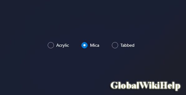
Microsoft has already begun work on the next big feature called “Windows 11 22H2”. Which is expected to launch in the fall of 2022. As part of Windows 11 version 22H2, Microsoft plans to improve the existing OS interface with Mica +. Fluent in more apps using different frameworks.

As you probably know, Fluent Design is a design language part of both. Windows 11 and Windows 10, and it embraces light and depth to move away from the flat look of Windows 8. It comes with design materials like “Acrylic”. Which is a transparent element for menus, dialog backgrounds or full app windows. Although it has a transparent effect, Mica is a subtle change and it samples the desktop wallpaper once to create its visualization, so it is faster than the acrylic material.
At the moment, Windows 11’s Mica doesn’t work with all modern apps, but that may change soon. According to a new reference found in the Windows 11 preview build (build 22509 or later). Microsoft plans to expand the Mica to the “framehost titlebar” of modern apps or even legacy apps.
Mica is already present in the original apps, unable to benefit from Mica in some modern program production build. Microsoft now seems to be testing the “MicaBackdropInApplicationFrameHostTitlebar” flag, which is reflected in new builds. As the name suggests, the flag adds a Windows 11 Mica effect to the app’s title bar, like a feedback hub.
“Tabbed” design material stains – Windows 11 to get more design
Interestingly, it looks like the tech giant is experimenting with another design element called “Tabbed” which is based on Mica or it could be a variant of Mica.
In the Win32 API of the Windows 11 Build 22523 SDK, users find new and weird ‘tabbed’ design elements.
- Acrylic
- Mica
- Tabbed